
In 2025, mobile shopping is no longer just “the future”—it’s the dominant reality. Over 75% of Shopify traffic now comes from smartphones, meaning your store’s mobile-first design directly impacts conversions, sales, and customer trust. If your Shopify store isn’t optimized for mobile, you’re leaving money on the table.
This playbook will guide you through designing a mobile-first Shopify store in 2025 that keeps shoppers engaged and ready to buy.
Why Mobile-First Matters in 2025
- Mobile = Majority Traffic: Most shoppers browse and buy directly on their phones.
- Google Ranking Boost: Mobile-first design improves SEO and Core Web Vitals.
- Faster Checkout: Mobile-optimized stores reduce cart abandonment rates.
- Better UX = Higher Conversions: A smooth mobile experience builds trust and encourages repeat buyers.
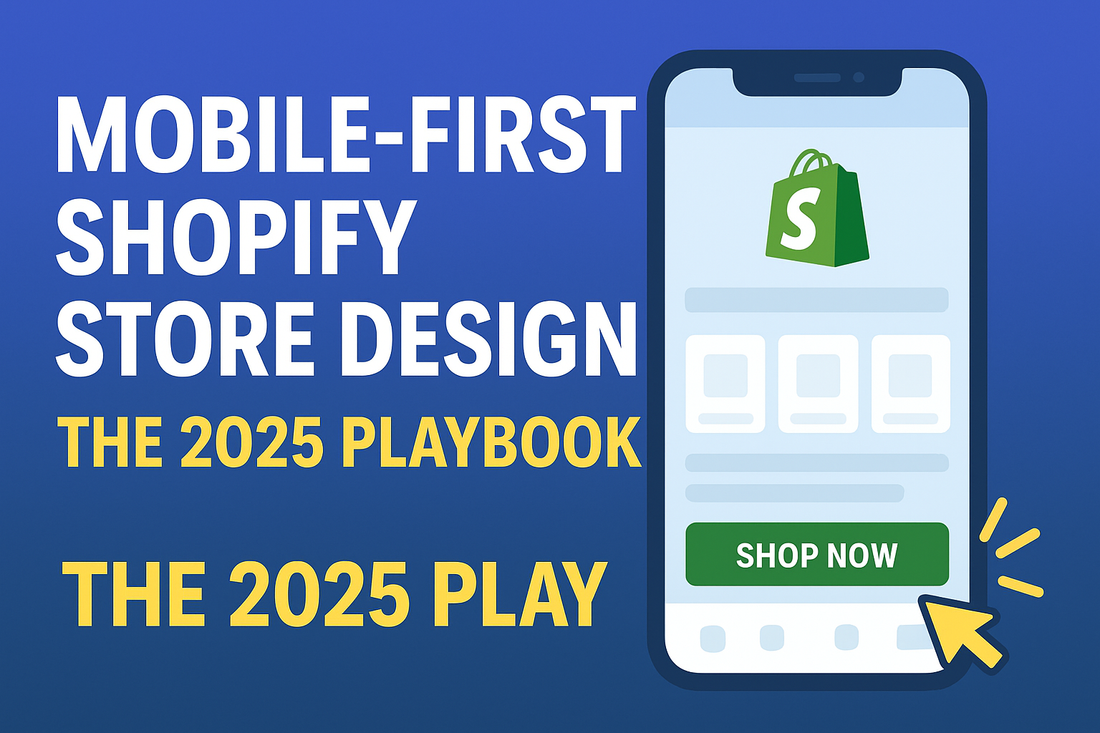
1. Simplify Navigation for Thumbs
- Use a sticky header with a hamburger menu.
- Keep CTA buttons large and easy to tap.
- Add a bottom navigation bar for faster access (like Instagram or TikTok).
✅ Example: A “Shop Now” button always visible at the bottom of the screen.
2. Optimize Images & Videos
- Use Shopify’s responsive image sizes (
img_url: '800x'). - Compress images without losing quality (TinyPNG, Crush.pics).
- Use vertical video content (9:16 ratio) for TikTok-style storytelling.
⚡ Tip: Lifestyle images outperform studio shots for mobile shoppers.
3. Speed Is Everything
- Choose a lightweight Shopify theme (Dawn, Sense, Craft).
- Limit third-party apps—use only what’s essential.
- Enable Shopify’s native lazy loading for product images.
🔑 Goal: Keep page load under 3 seconds on 4G.
4. Mobile-First Checkout
- Enable Shop Pay, Apple Pay, Google Pay for one-tap checkout.
- Minimize form fields (use autofill).
- Add a progress bar so customers know how many steps remain.
📊 Studies show one-click payment boosts conversions by up to 30%.
5. Leverage Micro-Interactions
- Add animated buttons (like a pulse on “Add to Cart”).
- Show cart drawer popups instead of redirecting to cart page.
- Use pop-up offers sized for mobile screens (not fullscreen takeovers).
6. Test Across Devices
- Use Shopify’s Preview Mode for mobile.
- Test on iOS, Android, and tablets.
- Run A/B tests with Shopify Plus or apps like Google Optimize.
⚡ Rule: If it doesn’t look great on a 6-inch screen, fix it.
✅ Final Thoughts
In 2025, your Shopify store must be mobile-first, not just mobile-friendly. By focusing on speed, navigation, checkout, and engagement, you’ll turn casual browsers into loyal buyers.
If you’re ready to launch a mobile-optimized, conversion-focused Shopify store, our team at eStoresMaker builds and delivers pre-designed Shopify stores ready to sell from Day One.
👉 Start your mobile-first journey today!